With the recent unveilings of the rather terrible Canadian Olympic jerseys and the total failure of the New Jersey "Jersey" jerseys, we got a bit of good news out of the Penguins on Wednesday with their throwback alternate jerseys. And that brings us to the last two days where we've seen good, bad, and "someone better be getting fired" jerseys revealed at the NHL, U SPORTS, and NCAA levels. There are four new jerseys, so let's not waste any time here as we have new clothes to see!
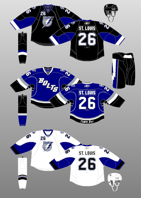
We'll start with the Tampa Bay Lightning who were part of the unveiling of the Stadium Series jerseys on Thursday. While Stadium Series jerseys are something I honestly pay little attention to since they're always awful and rarely worn, this design by the adidas and the Lightning breaks all the unwritten rules of marketing and branding. The Tampa Bay Lightning are the Lightning in every situation where they are professionally referenced. There is no exception to this rule unless you're posting on NHL fan forums or sending a text message in some non-professional setting. They are NOT the "Bolts" and should never be called the "Bolts" because they are the "Lightning"! Why does the NHL allow teams to use colloquial nicknames in a professional setting like an NHL game?
I hated the "Bolts" in blue. I hated the "Bolts" more when they switched to black. Wearing white doesn't change the hate I have for them wearing "Bolts" once again. You're the Lightning, not the Lightning Bolts, the Thunderbolts, or Nuts-and-Bolts. For the last time, stop wearing a name that isn't your team name! This earns a FAIL from me.
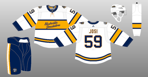
If the Lightning are the visiting team playing in the Stadium Series game, they need a home team to play against and that's there Nashville Predators enter the picture. In all honestly, they should have skipped picture day altogether if they wore the jersey seen to the left because they also failed the marketing and branding part of the Hockey 101 course. I don't know who allowed adidas and Nashville to put their colloquial name of "Smashville" on the front of their uniforms, but this might be one of the biggest failures in jersey history since there doesn't appear to be a Predators logo anywhere on the jersey to help one identify who this team is. This entire design is... something. Not something good, though.
How on earth do you go from being the visitors in the 2020 Winter Classic and looking classy to wearing something you'd find at a Nashville airport gift shop for game in front of your own fans? The actual jersey template isn't bad, but it's the garbage laid over top of it that makes you wonder why people haven't been fired over this.
The typeface, called "Knockout" simply looks horrible when rendered on a jersey, and it shouldn't be used in a professional setting unless the Predators are doing some sort of concert poster series to go along with the game. The guitar pick is a secondary logo at best, and, as stated above, there are no primary logos anywhere to be found. This is beyond embarrassing when one considers neither "Nashville" nor "Predators" nor their primary logo appear on the jersey. This is an epic FAIL on everything but the jersey template.
From the NHL, we'll move to U SPORTS as there was a women's hockey team who introduced a new alternate jersey to the world on Thursday through a video posted on social media.
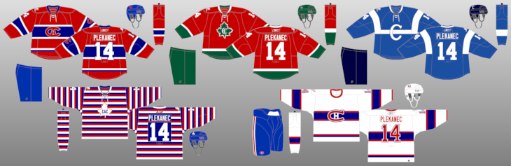
The Concordia Stingers women's hockey team will have a new black alternate jersey moving forward as they unveiled these new threads on Thursday to the world. You know my feelings on black jerseys, but this one has another layer of intrigue to it because it would appear they look like someone else.
Let's start with the obvious: black is not one of Concordia's colours, so this is just a black jersey for a black jersey's sake. Concordia is yellow and burgundy in terms of the Stingers, and black doesn't even hit their colour scheme outside of being a neutral colour. Throwing a black alternate into the mix when the school has burgundy, green, orange, or gold as potential options just seems lazy. It's been done before. Be original, Concordia.
I don't hate the diagonal writing, but that seems lazy and unoriginal as well, especially after Pittsburgh's unveiling earlier this week. I'll give Concordia a little bit of wiggle room here, though, because wearing the name of the school on the front of the jersey does feel more "collegiate", but let's be very clear that a team like the "Stingers" could have gone with all sorts of bee, hornet, scorpion, or other stinging-insect imagery as an alternate logo here. This seems like it would be an easy win to introduce an alternate logo to help sell some school-based merchandise, but that's apparently a moot point now.
What bothers me more than anything else is that the Stingers show a striking resemblance to the uniforms the OUA's Guelph Gryphons wear when on the road. These two teams will never meet in a regular-season game with Concordia playing in the RSEQ, but the fact that we have two teams in two conference wearing jerseys that are somewhat similar makes me question whether or not we've run out of design ideas. The fact that Concordia has all of those other primary and secondary colours identified for them to use by Concordia University itself would seem to indicate that this black jersey is just falling into the same marketing strategy that wearing black is intimidating and scary and mean. Instead, it's just a colour that's been overused. As a result, this one falls into the FAIL category.
Finally, Friday's unveiling in the NCAA saw the Boston College Eagles women's hockey team roll out some rather spectacular jerseys, and the manufacturer of said jerseys is not your normal hockey outfitter. The new striped edition of the Eagles jerseys were made by New Balance, better known for their running shoes, rather than CCM, Bauer, Under Armour, Nike, or any of the other big hockey companies. The New Balance Team Sports' website doesn't even offer hockey as an option in their "Uniforms" menu, so these new Boston College uniforms appear to be one of the first hockey endeavours by the company. Consider me impressed by their effort because Boston College's women's team is going to look sharp!
I think we can all admit that the hockey world can use more striping across the entire jersey. While one can get carried away with the striping in some cases, there's something good and wholesome about having colourful stripes on a hockey jersey. Seeing Boston College in these stripes after all the black jerseys and the Stadium Series garbage up above makes them quite literally one of the best jerseys seen in 2021 and, perhaps, in some time.
The marketing and branding people are happy too. Primary logo used? Check as it's on the shoulder. Name used? Check. Easy to identify who it is? Check. Proper use of colours from the colour scheme? Check and check. Quite frankly, the two professional teams above should be taking lessons from the ladies at Boston College because this is how hockey should look. Give Boston College top marks for this jersey as this one earns a PASS with honours!
There are four new jerseys for you to opine on in the comments. What say you, readers? Do you agree with me? Disagree entirely? Hit the comments and let me know!


No comments:
Post a Comment