After examining the new merchandise offerings that Adidas and the NHL coughed up for this season for the Western Conference with the new Reverse Retro line of jerseys, it's time to tackle the Eastern Conference where we saw some rather questionable designs on the first attempt at doing this Reverse Retro experiment. We'll dive back into this money-churning effort today as we break down another division with the Atlantic Division leading the way!
Four Original Six teams make up half the division, so the options for these teams and the designs they choose are plentiful. Beyond that, we have both teams who joined the NHL in 1992 in Ottawa and Tampa Bay, and a third 1990s expansion team in the Florida Panthers who jumped into thr fray in 1993. Add in the 1970 expansion team in the Buffalo Sabres, and the division is a solid mix of old and new. Will the designs be traditional? Bold? Way out there? Let's take a peek at how this division looks.

The Boston Bruins have a wide selection of potential uniforms they could have used, but they went with the 1995 Pooh Bear alternate jersey as their new Reverse Retro. Owning one of these jerseys myself, people always seem to comment on it - both good and bad - but it's certainly hard to miss with its yellow base colour. The Bruins opted to swap the white and yellow on the colours, and I have to say that, for the lack of effort in being creative, the colour swap actually works really well! I actually appreciate the Bruins for not doing another black jersey here, and I find they've exhausted a lot of their yellow options with heritage jerseys. Going white with the Pooh Bear jersey really gives it a new look and feel, so chalk this one up as
GOOD!
The Buffalo Sabres went back to their red-and-black era for the logo, but rendered it in the current blue-and-yellow scheme which works really well. They pulled the jersey design from the black jersey they wore as it mimics the striping, but the lack of a shoulder yoke leaves me wanting more from this jersey. There should be a splash of colour up near the shoulders to break up all the white on this jersey, but it seems the Sabres aren't willing to use a yoke like they did on the white jerseys during the 1996-2006 era. Unfortunately, the B-sabre patch on the shoulder just isn't big enough as a splash of colour, but the overall aesthetic still works despite the jersey being overly white. It's not all bad, so this one falls into the
GOOD category!
The Detroit Red Wings are the first Eastern Conference team to go oh-fer-two in the Reverse Retro jersey entries. The previous all-white jerseys were laughable at very best considering this team is named
RED Wings, but this new jersey may have reached a new low in how little of an effort was given. This jersey is a replica of a replica in that the Wings chose to replicate the 1991 100th anniversary edition replica of their 1927-28 sweaters worn by the Detroit Cougars. The striping is off, the colours don't work - when did Detroit ever have black in its colour scheme? - and the overall aesthetic doesn't give me the Winged Wheel feeling at all. Another solid
FAIL by the Red Wings on a Reverse Retro jersey that should have been quite easy to replicate.
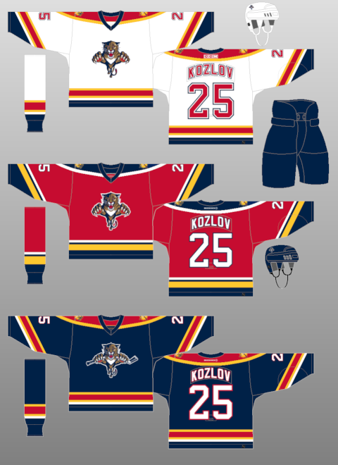
If there's one thing with which the Florida Panthers can't seem to find any magic, it's an alternate or specialty jersey. While the last Reverse Retro jerseys weren't overly terrible, the Panthers decided to invoke the light blue colour they used on their previous alterate jerseys worn in 2009 as their base colour. That's bold considering the colour, but they tried to replicate the 1998 version of their jerseys. The problem is that the '98 version had
an extra white stripe that was simply omitted on these new Reverse Retro jerseys. Toss in a rather questionable secondary logo when there were better logos that could be used combined with the 2009 alternate's shoulder patch that never caught on, and the Panthers have a rather jumbled mess of a jersey. The light blue won't save this one as this jersey is easy to rank as a
FAIL.
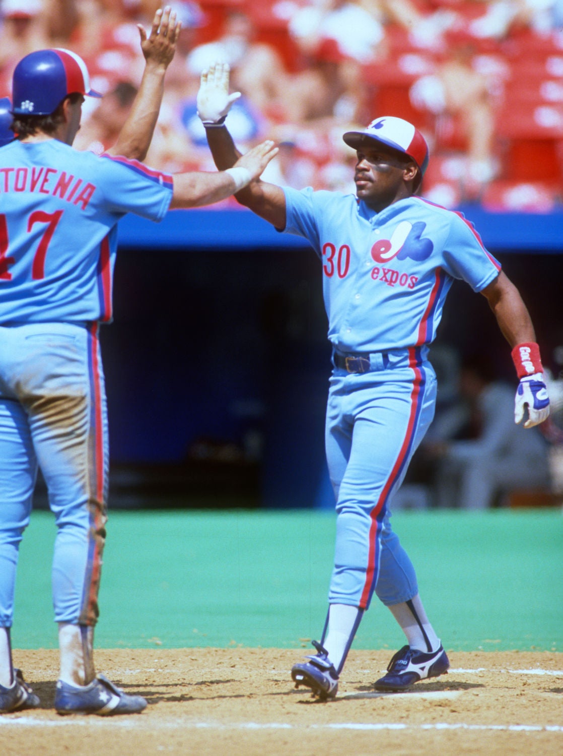
The Montreal Canadiens may have shocked everyone with their blue Reverse Retro jerseys a couple of years ago, but I liked that they were willing to think outside the box without going crazy. As we know, they celebrated their 100th anniversary with five different jerseys so drawing on a historical jersey would be difficult without being repetitive. Instead, they may have been inspired by their mascot, Youppi!, who was originally the mascot for MLB's Montreal Expos. Cue a light blue jersey in the Canadiens' chest-stripe design that should give fans Expos vibes. My gripe? They need some red on the striping and really should use
red customizing like the Expos did. In its current design, though, one can easily tell it's a Canadiens jersey thanks to that traditional Canadiens' look and a logo that pops off the chest, and that makes this new Reverse Retro jersey
GOOD!
The Ottawa Senators have done a lot right in the last few years when it comes to building a young, competitive team, but they seem to be baffled by what to dress those players in when they take the ice. Since 2021, the Senators somewhat returned to their original logo and jersey design they wore in 1992 when they first took the ice, and it seems to be working in creating this "new" identity for the kids they drafted. However, the new Reverse Retro jersey seems to be a mess when one considers that the Senators wore three colours - red, black, and white - to make the 1997 design work. Using two colours loses all effect that the white and black contrasts had on the red alternate jersey in '97, and the wavy striping used behind the logo just looks off. In no way should this have been the approved design for the Senators, so this Reverse Retro effort is a complete
FAIL.
I'll be honest: the Tampa Bay Lightning "Storm" alternate jersey worn from 1996 through 1999 might have been one of my favorite jerseys of all-time. Seeing it return as part of the Reverse Retro jerseys this year pleased me very much, so you probably have a good idea where this ranks. However, this jersey does have a few flaws - the base colour of white doesn't work as well as a darker colour, and I'd almost want to see it rendered in black over its original blue base colour. The problem, though, is that the Lightning went white, so the chest logo doesn't pop as well as it did in 1996. Additionally, I'm not too sure how many storms don't have a dark feeling to them, so white just seems off here. That said, I am biased towards this jersey because it used the sublimation so well, so this replica of the Lightning alternate jersey will always be
GOOD in my books. It just could have been better.
I have no issue with teams that want to use their Reverse Retro jerseys as a historical lesson, and the Toronto Maple Leafs have done that here with a replica of the jerseys they wore in 1962. The Leafs won four Stanley Cups in the 1960s starting in 1962, so that was a fairly successful decade for the blue-and-white. However, I'm choosing to believe that the Leafs chose this design because 1962 was the first year they wore TV numbers on the sleeves of their jerseys as a moment in uniform history. It should be noted that the Leafs didn't wear a white yoke on their 1962 blue jerseys, though, but they did on the white jerseys so it appears they inverted the colours of the white jersey. My gripe? It feels like we've seen this design before from 2016-21, so I can't be excited for it. Overall, though, this is a clean jersey that draws directly on the team's history, so this jersey is
GOOD!
Top To Bottom
If you asked me to rank the Atlantic Division's new looks from top to bottom in this division, it would look like this:
- Boston Bruins
- Montreal Canadiens
- Tampa Bay Lightning
- Buffalo Sabres
- Toronto Maple Leafs
- Florida Panthers
- Ottawa Senators
- Detroit Red Wings
What say you, readers - agree or disagree with the pass/fail grades? Is the overall ranking I gave anywhere close to your own feelings about the aesthetics of these jerseys? Leave your thoughts in the comments and we can discuss!
Until next time, keep your sticks on the ice!


No comments:
Post a Comment