As you may have seen if you have any sort of social media, yesterday was a big day for the NHL as all 32 NHL teams unveiled their 2022-23 edition of Adidas' Reverse Retro designs. The NHL has already tried this once back in 2021, so I don't understand this concept of introducing a jersey for one season only to mothball them a season later. If you want people to appreciate them today and in the future, the designs should stand the test of time and the jerseys should be liked by fans. For the most part, the 2021 effort left a lot to be desired as many NHL teams were mocked and ridiculed for the design choices they made, so I wasn't holding my breath for this next wave of expensive merchandise.
Today, we'll focus on one division as the Pacific Division is up first in my review of the new looks. There are some recent additions to the division as Seattle, Vegas, Anaheim, and San Jose all jumped into the fray over the last three decades, so I'm not sure how retro some of these teams can go. I will say that there were a couple of outstanding efforts in this division's 2023 Reverse Retro jerseys, though, so let's take a peek at how the left coast teams will look.

The Anaheim Ducks are first in the alphabetical order of the division, and they simply pulled their original 1993 design from the past, slapped a new coat of paint on the jersey, and presented it as done. While the previous Reverse Retro jersey was a white version of the Wild Wing alternate, this one is simply swapping orange in for eggplant and champagne in for jade. And just as we saw in 1993, there are no patches or additions to the jersey that the Ducks will wear. Simply put, it's a colourful twist on a proven design that harkens back to the early days of the franchise with the exact same design. Personally, I thought the Ducks might have jumped back to their black alternate for a variation on that, but this one works for the nostalgia factor alone. Chalk this one up as
GOOD.
The Calgary Flames may win the battle, but lose the war in this jersey. If that metaphor seems a little cryptic, allow me to point out that the flaming horse head is nowhere to be found. That's an automatic upgrade from the 2021 Reverse Retro jerseys because I despise Blasty. However, the Flames may have taken a major step backwards in making this a black jersey
AGAIN, and their choice in using the 1995 "Pedestal" design is a curious one considering not many liked it back then. While I don't have an issue with the use of historical jerseys, is there some reluctance to use actual sublimated flames on a Flames jersey? Is there a reason we can't get a Flames jersey in a yellow base colour? Being that I have a white 1995 version of this jersey, I can't fault them on the design choice, but the black jersey choice is always going to be a
FAIL.
The Edmonton Oilers jumped into the 2023 Reverse Retro jersey sweepstakes by pulling one of the best-selling alternate jerseys in history into the present day. The McFarlane-designed Oilers jersey is still one of the best alternate jerseys every worn in my humble opinion, but there are a handful of upgrades that drops this down a few notches. First, the drop in the middle of the gears cannot be orange in any world. The original drop was navy blue and looked like oil with its dark colour. Now that someone has labelled this jersey as the "fried egg" jersey, I can't unsee that when I look at the logo. Second, the lack of the silver in the striping makes the orange stripes feel out of place. I get the Oilers are using more orange in everything they do, but good designs don't need changing. I love the McFarlane-designed jerseys, so this jersey falls into the
GOOD category, but just barely.
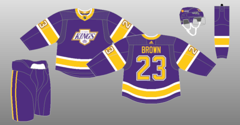
The Los Angeles Kings are the first team in this review who can officially wear both Reverse Retro jerseys in their closet and still look classy. I appreciate the Kings going back to their crown logo because that is clear indication of their team name. Using the "Forum Blue"-and-gold of the Jack Kent Cooke days also harkens back to the days of Rogie Vachon, the Triple Crown Line, and Miracle on Manchester. The jersey design is a close replication of what the team wore starting in 1980, and that might be the best design from their purple-and-gold era. What makes this jersey even better is that they went white with this one, meaning that if the Kings ever wanted to do a purple-and-gold era again they now have a white and
a dark jersey they can wear as a set. That aside, I love the clean, historical design of this jersey, so this one is absolutely
GOOD!
The San Jose Sharks decided to take this whole Reverse Retro jersey thing to a new level. They did black jerseys with little fanfare. They did gray jerseys that barely moved the needle. People demanded more teal, and the team went back to teal this season. But they didn't just stop at 1991 with the teal Sharks returning, instead opting to go all the way back to 1974 when there was another team that owned northern California's market in the California Golden Seals! This jersey is everything awesome because the Golden Seals ditched the kelly green in 1974 for teal! It seems like this was too easy for the Sharks as they simply changed "Seals" to Sharks" on the front of the jersey, and completed this assignment in record time with virtually no effort, yet they look amazing while being historically correct. Full marks for the Sharks as this is the first Sharks jersey that I'd consider buying in long time, so it must be
GOOD!
It's hard to imagine a second-year team like the Seattle Kraken to have a lot of previous options to draw on when designing a retro jersey, but the Kraken decided to honour a former local team with their design. The Kraken looked back into Seattle hockey history, and
chose to honour the Seattle Ironmen who played in the Northwest Industrial Hockey League in 1943-44 during World War II and joined the PCHL following the war for eight more seasons. If you're looking at the jersey to the left, that's not a white base on that jersey, but a light blue base with the navy striping to recreate the stripes of the Ironmen. I don't have a problem with the Kraken drawng on Seattle hockey history nor matching the colour scheme of its mascot, but it's hard to draw on history that happened 80 years ago and have people go "that's Seattle hockey." Nonetheless, this jersey works in its unique design with the light blue jersey base, so count this one as
GOOD.
I actually spoke about the Vancouver Canucks' new Reverse Retro jerseys when the design
leaked out to the internet on July 25, but let's venture down that same path again today as the Canucks made that design official. This new Reverse Retro design is a throwback to the 1962-63 Vancouver Canucks jersey worn by the former PCHL and WHL Canucks when they played in Vancouver. The logo, with the frayed pant legs and the less pronounced stick, is identical to what the '62-63 Canucks wore, and the stripe pattern appears to be similar to the '62-63 team. Where I struggle with this new Reverse Retro jersey is the use of Johnny Canuck for the Vancouver Canucks jersey after they chose to make Johnny Canuck the identity of the AHL's Abbotsford Canucks. The Canucks are free to choose whatever logo they want to wear, but why dress your NHL players in a historically minor-league logo? Even as an homage to that 1962-63 Vancouver team, someone from the Canucks didn't notice this fact? I still can't get past that, and, because of that fact, these jerseys fall into
FAIL territory.
If you ever wondered why you don't see more glow-in-the-dark hockey jerseys, the Vegas Golden Knights will solve that for you with their new Reverse Retro jersey! Aside from the fact that hockey is usually played under arena lighting, we know Vegas likes to put on a show before, during, and after their games. What better way to do so than having the jerseys glow in the dark and under black light? If you're asking the jersey relates more to Vegas than you may have realized as the Golden Knights use Excalibur Hotel-inspired lettering for the diagonal wordmark and Stardust Hotel-inspired number font on the sleeves and back of the jersey. However, the choice of black seems uninspired yet necessary for the glowing portion, and the diagonal name across the chest could have been used in combination with more glowing elements on the jersey. When used in light, these don't wow anyone and that's where they'll be seen the most. Vegas should have done better because these
FAIL.
Top To Bottom
If you asked me to rank the Pacific Division's new looks from top to bottom in this division, it would look like this:
- Los Angeles Kings
- San Jose Sharks
- Seattle Kraken
- Anaheim Ducks
- Edmonton Oilers
- Vegas Golden Knights
- Calgary Flames
- Vancouver Canucks
What say you, readers - agree or disagree with the pass/fail grades? Is the overall ranking I gave anywhere close to your own feelings about the aesthetics of these jerseys? Leave your thoughts in the comments and we can discuss!
Until next time, keep your sticks on the ice!


No comments:
Post a Comment